

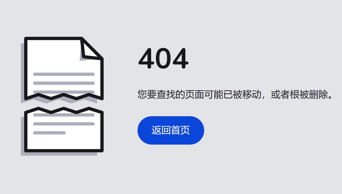
html+css实现纸张撕裂404错误页面动画效果,演示Ripped 404 Page Animation (bokequ.com)
1、html页面代码
<html>
<head>
<meta charset="UTF-8">
<title>Ripped 404 Page Animation</title>
<meta name="viewport" content="width=device-width, initial-scale=1, viewport-fit=cover">
<link rel="stylesheet" type="text/css" href="css/style.css">
<link rel='stylesheet' href='css/css2.css'>
</head>
<body>
<main>
	<div>
		<svg class="paper" viewBox="0 0 300 300" width="300px" height="300px" role="img" aria-label="A piece of paper torn in half">
			<g class="paper__outline" fill="none" stroke="hsl(0,10%,10%)" stroke-width="8" stroke-linecap="round" stroke-linejoin="round" transform="translate(61,4)">
				<g class="paper__top" transform="translate(0,25)">
					<polygon class="paper__shadow" fill="hsl(0,10%,70%)" stroke="none" points="0 148,0 0,137 0,187 50,187 148,155 138,124 148,93 138,62 148,31 138" transform="translate(-12,12)" />
					<rect class="paper__tear-fill" fill="hsl(0,0%,100%)" stroke="none" x="0" y="137" width="0" height="23px" />
					<polygon class="paper__fill" fill="hsl(0,0%,100%)" stroke="none" points="0 148,0 0,137 0,187 50,187 148,155 138,124 148,93 138,62 148,31 138" />
					<polygon class="paper__shadow" fill="hsl(0,10%,70%)" stroke="none" points="137 0,132 55,187 50,142 45" />
					<polyline points="137 0,142 45,187 50" />
					<polyline points="0 148,0 0,137 0,187 50,187 148" />
					<g class="paper__lines" stroke="hsl(0,10%,70%)">
						<polyline points="22 88,165 88" />
						<polyline points="22 110,165 110" />
						<polyline points="22 132,165 132" />
					</g>
					<polyline class="paper__tear" points="0 148,31 138,62 148,93 138,124 148,155 138,187 148" stroke-dasharray="198 198" stroke-dashoffset="-198" />
				</g>
				<g class="paper__bottom" transform="translate(0,25)">
					<polygon class="paper__shadow" fill="hsl(0,10%,70%)" stroke="none" points="0 148,31 138,62 148,93 138,124 148,155 138,187 148,187 242,0 242" transform="translate(-12,12)" />
					<polygon class="paper__fill" fill="hsl(0,0%,100%)" stroke="none" points="0 148,31 140,62 148,93 138,124 148,155 138,187 148,187 242,0 242" />
					<polyline points="187 148,187 242,0 242,0 148" />
					<g class="paper__lines" stroke="hsl(0,10%,70%)">
						<polyline points="22 154,165 154" />
						<polyline points="22 176,165 176" />
						<polyline points="22 198,94 198" />
					</g>
					<polyline class="paper__tear" points="0 148,31 138,62 148,93 138,124 148,155 138,187 148" stroke-dasharray="198 198" stroke-dashoffset="-198" />
				</g>
			</g>
		</svg>
	</div>
	<div>
		<h1>404</h1>
		<p>您要查找的页面可能已被移动,或者根被删除。</p>
		<a class="btn-link" href="http://www.bokequ.com/">返回首页</a>
	</div>
</main>
</body>
</html>
2、css样式
* {
	border: 0;
	box-sizing: border-box;
	margin: 0;
	padding: 0;
}
:root {
	--hue: 223;
	--bg: hsl(var(--hue),10%,90%);
	--fg: hsl(var(--hue),10%,10%);
	--primary: hsl(var(--hue),90%,45%);
	--primary-down: hsl(var(--hue),90%,65%);
	--trans-dur: 0.3s;
	font-size: calc(16px + (24 - 16) * (100vw - 320px) / (2560 - 320));
}
body {
	background-color: var(--bg);
	color: var(--fg);
	display: flex;
	font: 1em/1.5 Nunito, sans-serif;
	height: 100vh;
	transition:
		background-color var(--trans-dur),
		color var(--trans-dur);
}
main {
	display: grid;
	grid-gap: 3em 1.5em;
	margin: auto;
	max-width: 40em;
	padding: 3em 0;
	text-align: center;
	width: calc(100% - 3em);
}
h1 {
	font-size: 3em;
	line-height: 1;
	margin: 0 0 1.5rem;
}
p {
	margin: 0 0 1.5em;
}
.btn-link {
	background: var(--primary);
	border-radius: 1.5em;
	display: inline-block;
	outline: transparent;
	padding: 0.75em 1.5em;
	text-align: center;
	text-decoration: none;
	transition: background-color 0.15s linear;
}
.btn-link,
.btn-link:visited {
	color: hsl(0,0%,100%);
}
.btn-link:focus-visible,
.btn-link:hover {
	background: var(--primary-down);
}
.btn-link:hover {
	text-decoration: none;
}
.paper {
	display: block;
	margin: auto;
	overflow: visible;
	width: 100%;
	max-width: 224px;
	height: auto;
}
.paper__fill {
	fill: hsl(0,0%,100%);
}
.paper__outline,
.paper__lines {
	transition: stroke var(--trans-dur);
}
.paper__outline {
	stroke: hsl(var(--hue),10%,10%);
}
.paper__lines {
	stroke: hsl(var(--hue),10%,70%);
}
.paper__shadow {
	fill: hsl(var(--hue),10%,70%);
	transition: fill var(--trans-dur);
}
.paper__top,
.paper__bottom,
.paper__tear,
.paper__tear-fill {
	animation: paperTop 1.25s cubic-bezier(0.77,0,0.18,1);
}
.paper__top,
.paper__bottom {
	transform-origin: 0 148px;
	transition: transform var(--trans-dur) cubic-bezier(0.77,0,0.18,1);
}
.paper__top {
	transform: translate(0,8px);
}
.paper__bottom {
	animation-name: paperBottom;
	transform: translate(0,42px);
}
.paper__tear,
.paper__tear-fill {
	animation-timing-function: cubic-bezier(0.32,0,0.67,0);
}
.paper__tear {
	animation-name: paperTear;
	stroke-dashoffset: 0;
}
.paper__tear-fill {
	animation-name: paperTearFill;
}
.paper__outline:hover .paper__top,
.paper__outline:hover .paper__bottom {
	transform: translate(0,25px);
}

/* Dark theme */
@media (prefers-color-scheme: dark) {
	:root {
		--bg: hsl(var(--hue),10%,25%);
		--fg: hsl(var(--hue),10%,90%);
	}
	.paper__shadow:first-child {
		fill: hsl(var(--hue),10%,15%);
	}
}

/* Beyond mobile */
@media (min-width: 768px) {
	main {
		grid-template-columns: 1fr 2fr;
		align-items: center;
		text-align: left;
	}
	.paper {
		max-width: 300px;
	}
}

/* Animations */
@keyframes paperTop {
	from,
	40% {
		animation-timing-function: cubic-bezier(0.32,0,0.67,0);
		transform: translate(0,25px) rotate(0);
		transform-origin: 61px 148px;
	}
	70% {
		animation-timing-function: cubic-bezier(0.33,1,0.67,1.5);
		transform: translate(0,25px) rotate(-5deg);
		transform-origin: 61px 148px;
	}
	to {
		transform: translate(0,8px) rotate(0);
		transform-origin: 0 148px;
	}
}
@keyframes paperBottom {
	from,
	40% {
		animation-timing-function: cubic-bezier(0.32,0,0.67,0);
		transform: translate(0,25px) rotate(0);
		transform-origin: 61px 148px;
	}
	70% {
		animation-timing-function: cubic-bezier(0.33,1,0.67,1.5);
		transform: translate(0,25px) rotate(5deg);
		transform-origin: 61px 148px;
	}
	to {
		transform: translate(0,42px) rotate(0);
		transform-origin: 0 148px;
	}
}
@keyframes paperTear {
	from,
	40% {
		stroke-dashoffset: -198;
	}
	70%,
	to {
		stroke-dashoffset: 0;
	}
}
@keyframes paperTearFill {
	from,
	40% {
		width: 187px;
	}
	70%,
	to {
		width: 0;
	}
}
来源分享https://www.liuzhixi.cn/html/293.html
评论