

纯CSS实现超精美月兔404界面,一款超精美的月兔404前端页面代码,希望大家能喜欢。
背景设计+404月球设计+蹦跳的月兔设计。演示效果http://www.bokequ.com/show/404/3/
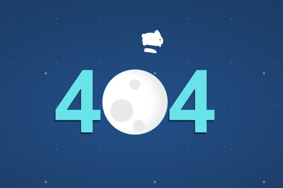
1、背景的设计为月球空间的感觉,它的实现主要用到了CSS中的一个函数:radial-gradient()radial-gradient() 函数用径向渐变创建 “图像”。
2、月球的设计由HTML和CSS完成,而旋转部分的实现则由CSS中的一个重要组件@keyframes来实现
<!DOCTYPE html>
<html lang="en" >
<head>
  <meta charset="UTF-8">
  <title>蹦跳的月兔404页面代码</title>
  <script type="text/javascript">
//五秒以后再跳转
setTimeout("javascript:location.href='http://www.bokequ.com'", 5000);</script>
  <style>
  *, *:after, *:before {
  box-sizing: border-box;
}

html {
  background: #23508a;
  background: radial-gradient(ellipse at center, #23508a 0%, #1b3b62 50%, #1a365b 100%);
  font-family: arial;
  min-width: 400px;
}

body {
  width: 100%;
  height: 100vh;
  margin: 0;
  background: radial-gradient(ellipse at center, #73859a 1%, rgba(114, 132, 152, 0) 2%, rgba(0, 0, 0, 0) 100%), radial-gradient(ellipse at center, #73859a 1%, rgba(114, 132, 152, 0) 2%, rgba(0, 0, 0, 0) 100%), radial-gradient(ellipse at center, rgba(115, 133, 154, 0.5) 1%, rgba(114, 132, 152, 0) 2%, rgba(0, 0, 0, 0) 100%);
  background-size: 250px 250px , 100px 100px , 60px 60px;
  background-repeat: repeat;
}

.figure {
  position: fixed;
  left: 50%;
  top: 50%;
  -webkit-transform: translate(-50%, -65%);
          transform: translate(-50%, -65%);
}

.error-no {
  font-size: 200px;
  font-weight: bold;
  display: -webkit-box;
  display: flex;
  -webkit-box-align: center;
          align-items: center;
  -webkit-box-pack: center;
          justify-content: center;
  color: #68e3e9;
  text-shadow: -2px 4px 2px rgba(0, 0, 0, 0.5);
}

.moon {
  width: 150px;
  height: 150px;
  border-radius: 50%;
  background: #fff;
  position: relative;
  display: inline-block;
  z-index: 10;
  overflow: hidden;
  box-shadow: -20px 0 20px #e9e9e9 inset;
  border: 1px solid #68e3e9;
}
.moon:after {
  content: '';
  position: absolute;
  left: 75px;
  top: 70%;
  width: 20px;
  height: 20px;
  border-radius: 50%;
  color: #e9e9e9;
  background: currentcolor;
  -webkit-animation: 5s spin linear infinite;
          animation: 5s spin linear infinite;
  box-shadow: -30px -50px 0 20px, 50px -30px 0 -8px , 50px -90px 0 2px ,  100px -90px 0 0px,  100px -40px 0 25px, 150px -15px 0 0px,  240px 15px 0 4px, 230px -80px 0 2px,   200px -20px 0 16px, 350px  0 0, 320px -50px 0 20px, 400px -30px 0 -8px, 400px -90px 0 2px;
}

.mj {
  position: relative;
  margin: auto;
  z-index: 30;
  width: 60px;
  -webkit-transform: scale(0.6) translatey(70%);
          transform: scale(0.6) translatey(70%);
}


@-webkit-keyframes spin {
  0% {
    left: 75px;
  }
  100% {
    left: -275px;
  }
}

@keyframes spin {
  0% {
    left: 75px;
  }
  100% {
    left: -275px;
  }
}

.rabbit {
  width: 5em;
  height: 3em;
  background: #ffffff;
  border-radius: 70% 90% 60% 50%;
  position: relative;
  -moz-transform: rotate(0deg) translate(-2em, 0);
  -ms-transform: rotate(0deg) translate(-2em, 0);
  -webkit-transform: rotate(0deg) translate(-2em, 0);
  transform: rotate(0deg) translate(-2em, 0);
  animation: hop 1s infinite linear;
  z-index: 1;
}
.no-flexbox .rabbit {
  margin: 10em auto 0;
}
.rabbit:before {
  content: "";
  position: absolute;
  width: 1em;
  height: 1em;
  background: white;
  border-radius: 100%;
  top: 0.5em;
  left: -0.3em;
  box-shadow: 4em 0.4em 0 -0.35em #3f3334, 0.5em 1em 0 white, 4em 1em 0 -0.3em white, 4em 1em 0 -0.3em white, 4em 1em 0 -0.4em white;
  animation: kick 1s infinite linear;
}
.rabbit:after {
  content: "";
  position: absolute;
  width: .75em;
  height: 2em;
  background: white;
  border-radius: 50% 100% 0 0;
  -moz-transform: rotate(-30deg);
  -ms-transform: rotate(-30deg);
  -webkit-transform: rotate(-30deg);
  transform: rotate(-30deg);
  right: 1em;
  top: -1em;
  border-top: 1px solid #f7f5f4;
  border-left: 1px solid #f7f5f4;
  box-shadow: -0.5em 0em 0 -0.1em white;
}

@keyframes hop {
  20% {
    -moz-transform: rotate(-10deg) translate(1em, -2em);
    -ms-transform: rotate(-10deg) translate(1em, -2em);
    -webkit-transform: rotate(-10deg) translate(1em, -2em);
    transform: rotate(-10deg) translate(1em, -2em);
    box-shadow: -0.2em 3em 0 -1em #fff;
  }
  40% {
    -moz-transform: rotate(10deg) translate(3em, -4em);
    -ms-transform: rotate(10deg) translate(3em, -4em);
    -webkit-transform: rotate(10deg) translate(3em, -4em);
    transform: rotate(10deg) translate(3em, -4em);
    box-shadow: -0.2em 3.25em 0 -1.1em #fff;
  }
  60%,75% {
    -moz-transform: rotate(0) translate(4em, 0);
    -ms-transform: rotate(0) translate(4em, 0);
    -webkit-transform: rotate(0) translate(4em, 0);
    transform: rotate(0) translate(4em, 0);
    box-shadow: -0.2em 1em 0 -0.75em #fff;
  }
}

@keyframes kick {
  20%,50% {
    box-shadow: 4em 0.4em 0 -0.35em #3f3334, 0.5em 1.5em 0 white, 4em 1.75em 0 -0.3em white, 4em 1.75em 0 -0.3em white, 4em 1.9em 0 -0.4em white;
  }
  40% {
    box-shadow: 4em 0.4em 0 -0.35em #3f3334, 0.5em 2em 0 white, 4em 1.75em 0 -0.3em white, 4.2em 1.75em 0 -0.2em white, 4.4em 1.9em 0 -0.2em white;
  }
}
  </style>
</head>
<body>
<!-- partial:index.partial.html -->
<div class="figure">
  <div class="mj">
    <div class='rabbit'></div>
  </div>
  <div class="error-no"> <span>4</span>
    <div class="moon"></div><span>4</span>
  </div>
</div>
<!-- partial -->
</body>
</html>
评论